Last fall I set myself the challenge of learning the location of every country in the world.
Geography apps helped me ace quizzes, but the knowledge didn't stick. What I needed was an app that could tell me something cool about each country - a reason to remember it.
The best resource I could find was a website called "Country A Day." I decided to redesign it into an app to teach people a little bit about every country in just a few minutes per day.
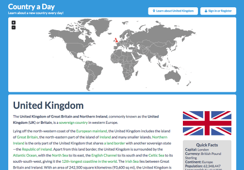
The original Country A Day website.
Helpful, but not very exciting.
It also lacked key features such as daily reminders and a way to test what was learned.
User Research
I established the following questions to guide my initial research:
- How do people use educational apps? What do they like most and least about them?
- What keeps people motivated to continue using an educational app?
- How can social components in educational apps enhance the experience?
- What elements of gaming are most enjoyable that might be incorporated into an educational app?
- What aspects of traditional classroom geography or history education are the most fun and effective?
A quick assessment of other educational apps provided some key insights:
Notifications, progress indicators and sensory rewards (sounds and images) such as those used by language app Duolingo keep users engaged in the learning process.
A clean aesthetic and intuitive navigation can make the difference between education being a fun game or a chore.
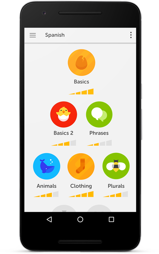
Duolingo app with fun progress indicators
Interviews & Survey
Interviews, including observation of participants with the old site, revealed the following user wishes:
- The ability to pick up a lesson again after being interrupted
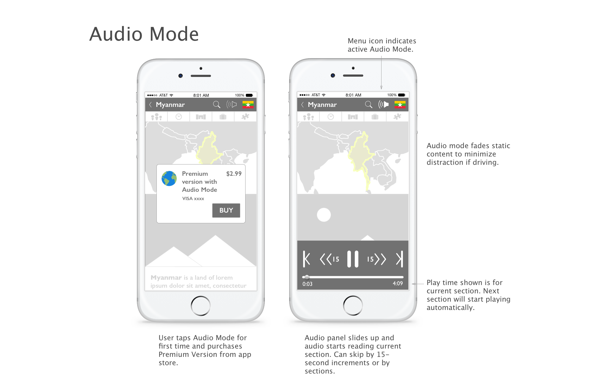
- An audio mode, to allow users to learn while driving to work, folding laundry etc.
- Relatable stories, such as a section told from a local’s viewpoint describing their daily life
- An expectation of swipe-through pages
- Interesting, bite-sized facts that could be "cocktail party" fodder. This feedback helped resist the temptation to give a more comprehensive overview and instead provide brief salient points users would be more likely to actually remember.
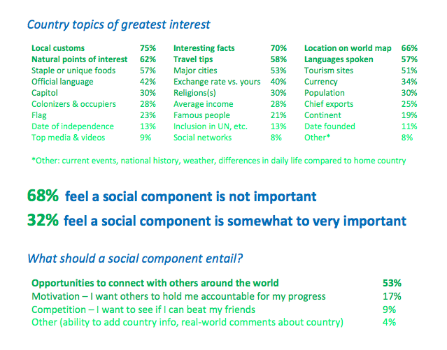
A survey conducted via the online platform Typeform helped establish what content was most interesting to users.
- Facts having to do with culture and travel were much more popular than historical detail, especially dates
- A social component appealed as a way to talk casually with those in other countries, rather than to compete or share with peers
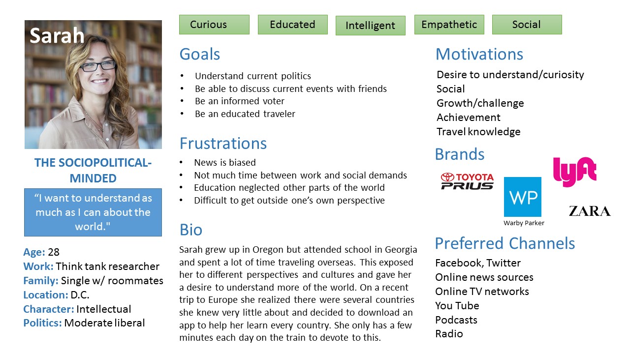
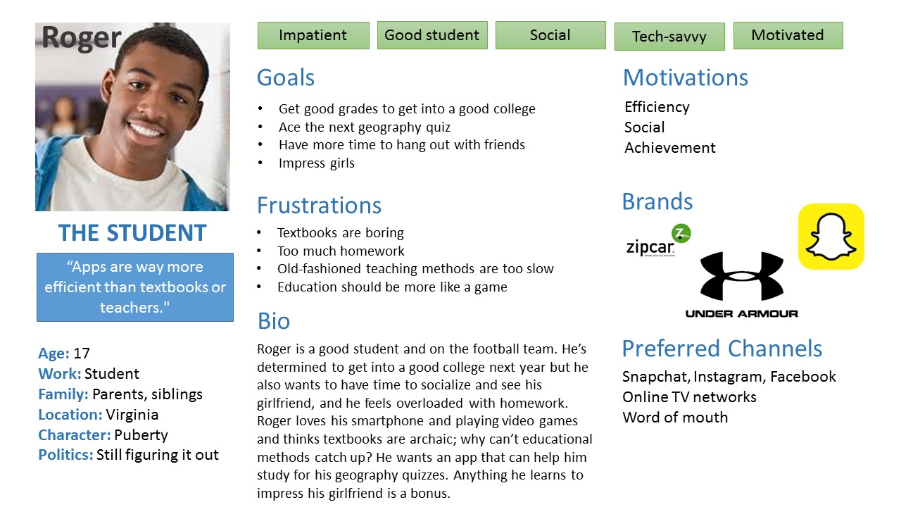
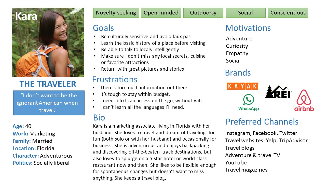
Personas, Empathy Maps & User Stories
Who would use the app, and how might they use it?
Interview and survey data suggested that most app users would be seeking:
- Enhancement of world knowledge and help understanding current world affairs,
- Inspiration and practical advice for world travel, and/or
- Assistance with learning world geography for school or fun
The three personas I imagined informed the design process as I considered how each would meet their specific goals of edification, travel or geography.
I had to reign in the temptation to build a comprehensive travel app. Instead I focused on using people's interest in travel as a way to get them excited about learning and inspire future adventures.
With personas in mind, I created empathy maps to consider each user's problems and goals, and brainstormed several user stories to determine the needs and wants for each task. Putting myself in the shoes of the user uncovered these desires:
- To customize notifications to occur at a time of day when I am likely to use it, i.e. during my commute
- To customize which continents to start with rather than learning all countries randomly, for instance to prepare for an upcoming trip to Asia
- To compare a country's statistics to my own so I can put it in perspective
Content Strategy
Card sorts helped organize the content into intuitive categories.
Two in-person card sorts established the five main content categories.
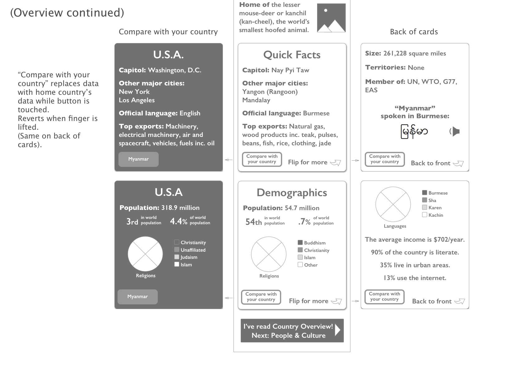
Participants suggested there was too much information in the Overview section, an insight that later guided the design decision to exclude some data and “hide” other data on the back of flip-cards as an option for those wishing to delve deeper.
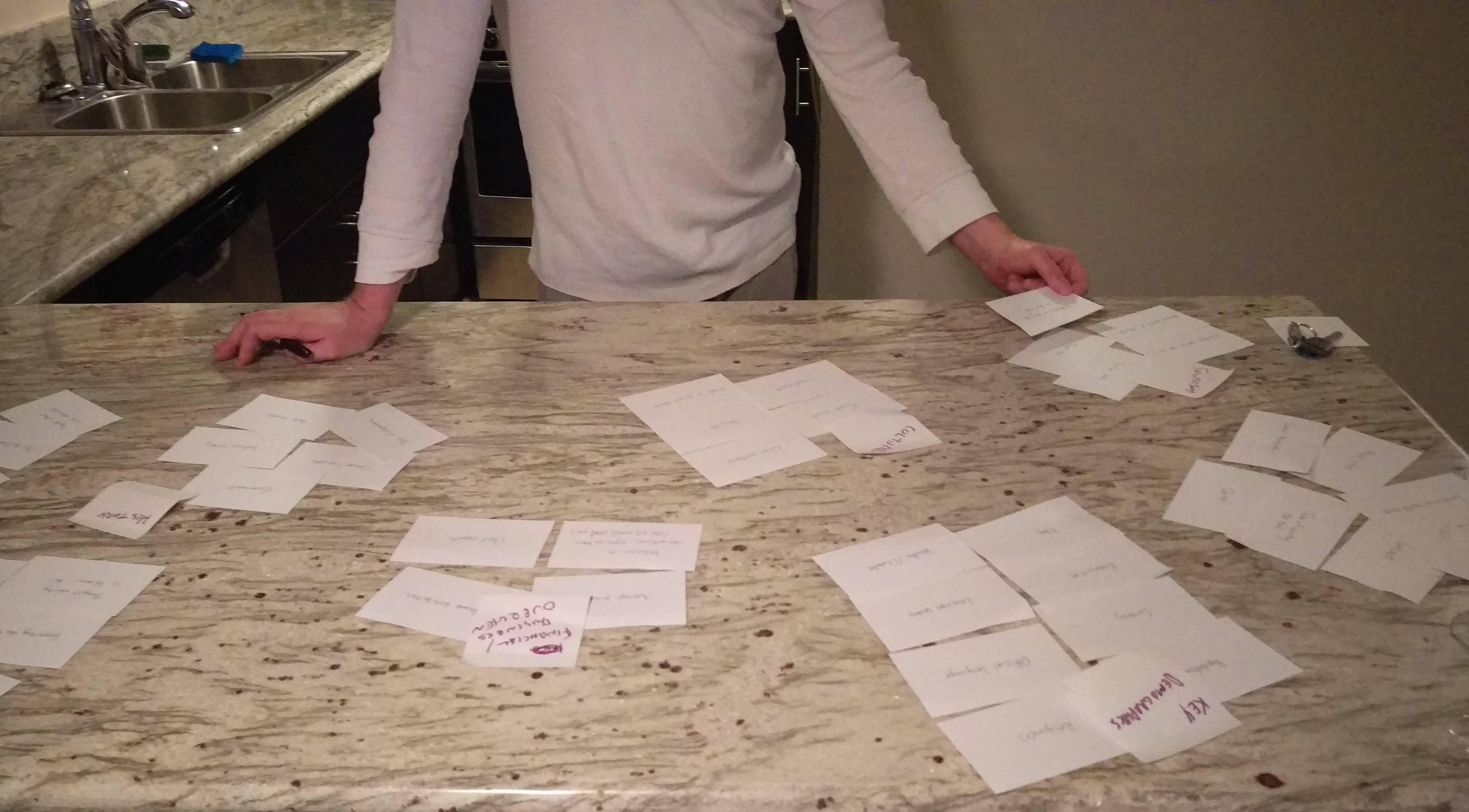
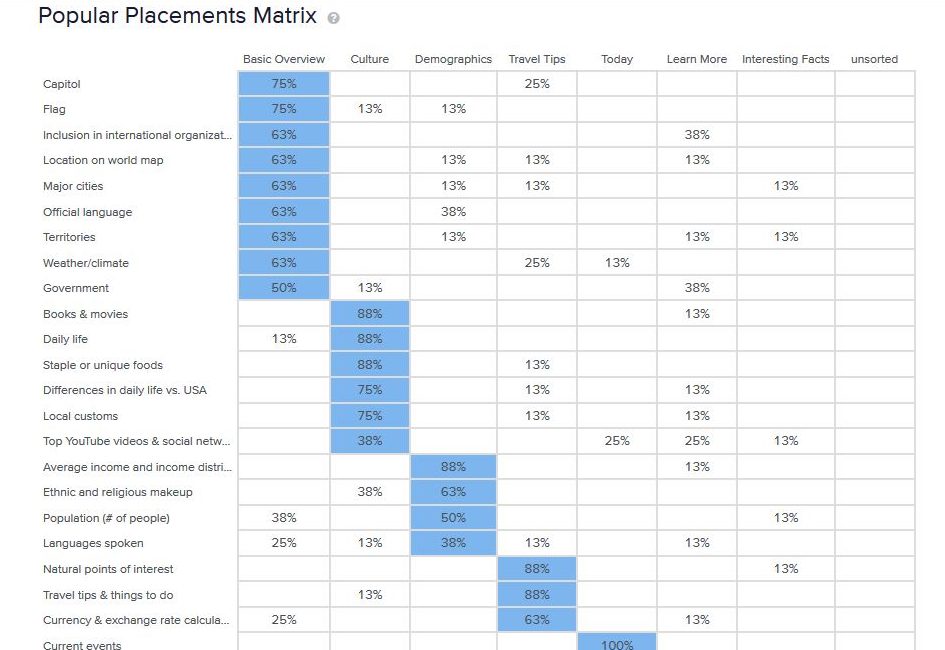
A digital card sort using the online software OptimalSort corroborated and refined the content organization.
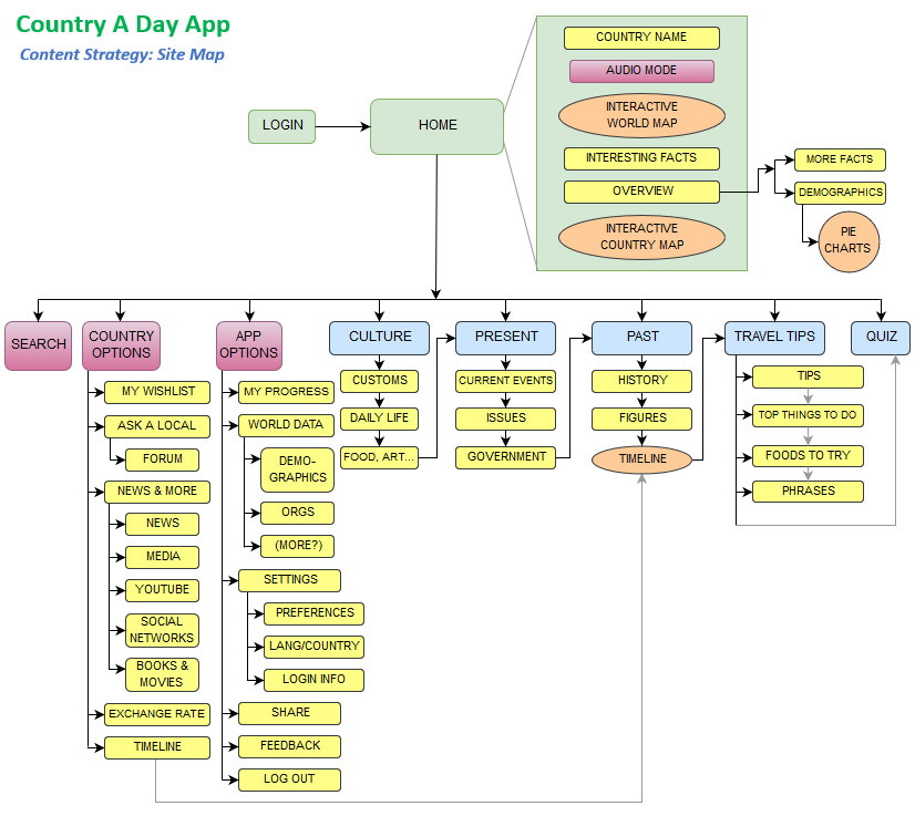
A site map provided the bones to shape the content structure.
It evolved throughout the wireframing and prototype stages.
User flows helped to sort out obstacles in user paths before delving into the wireframing process:
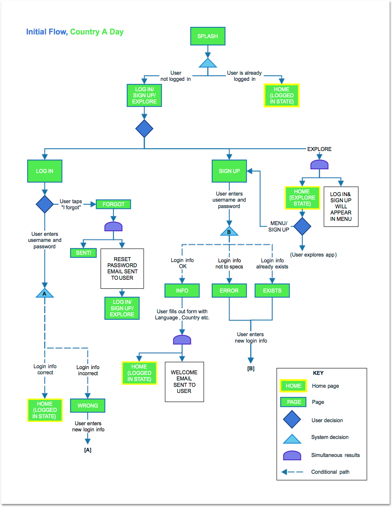
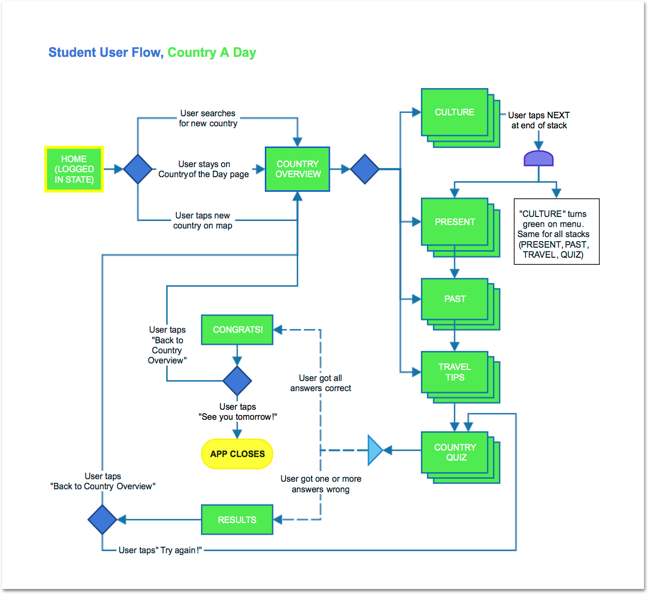
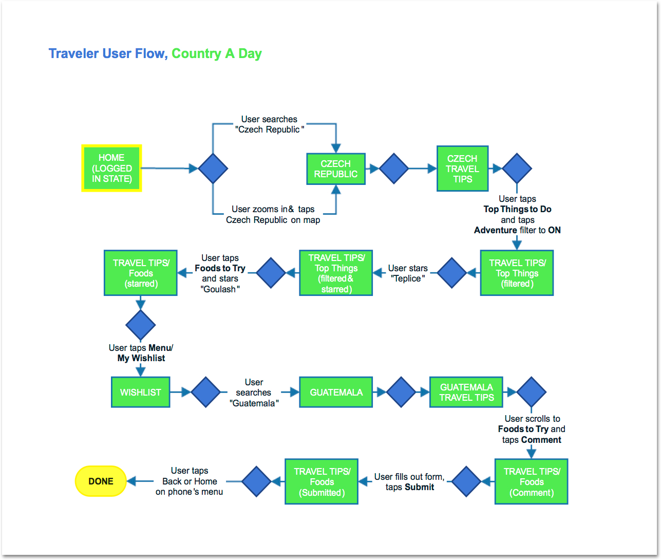
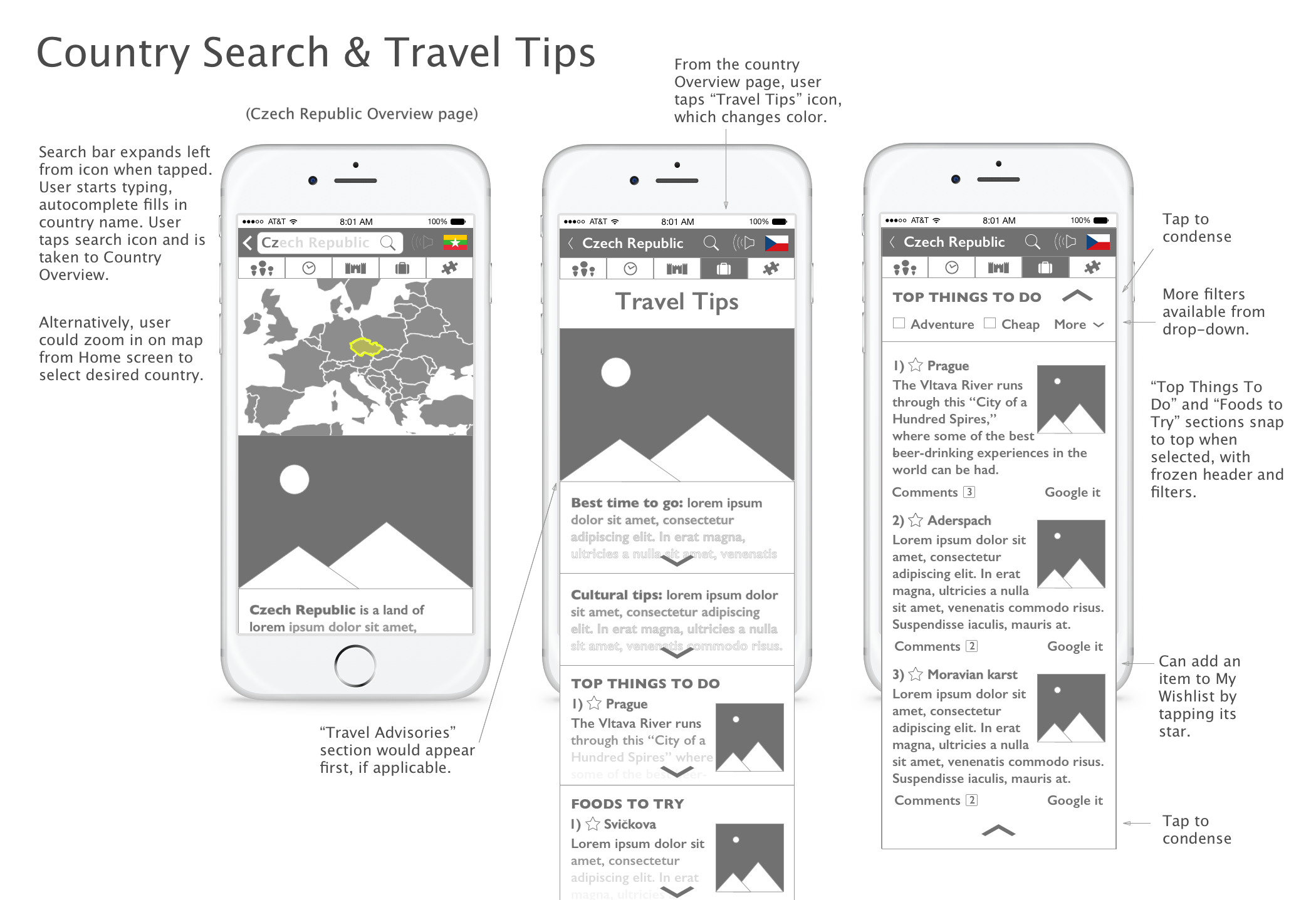
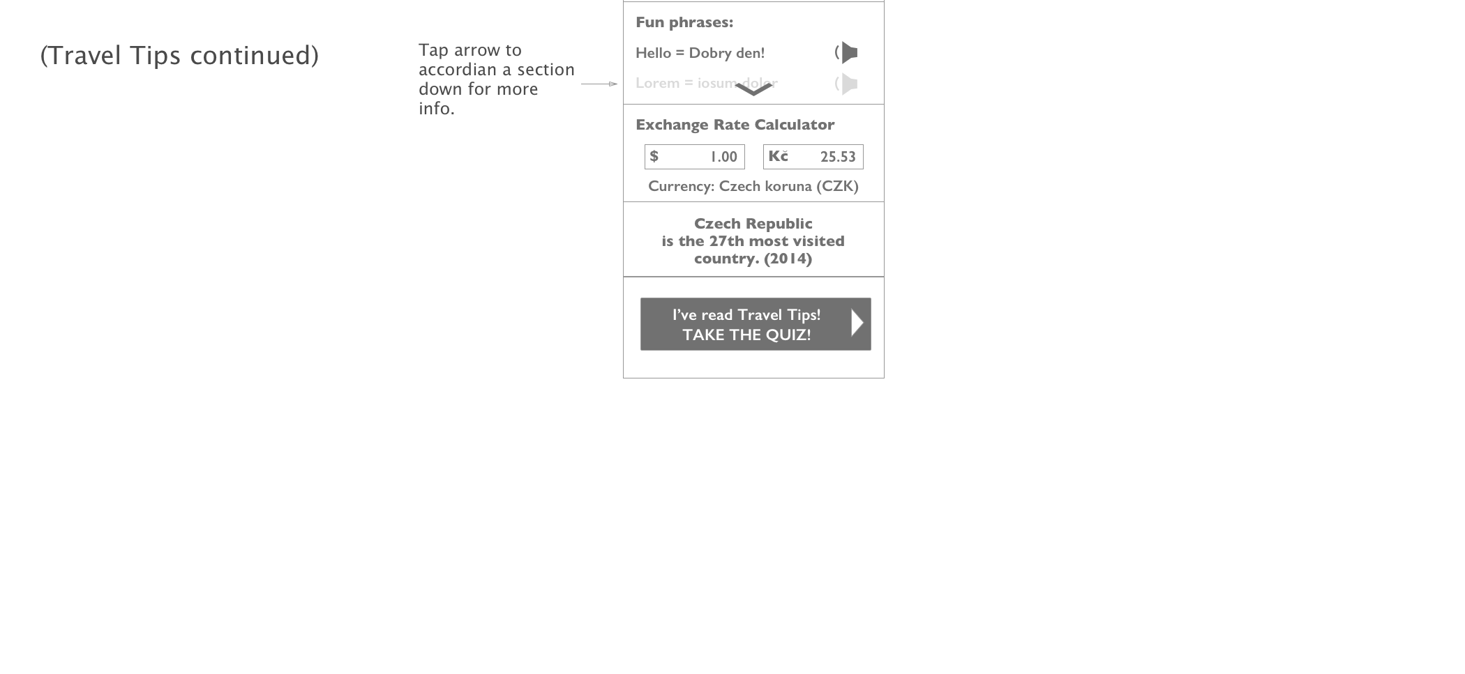
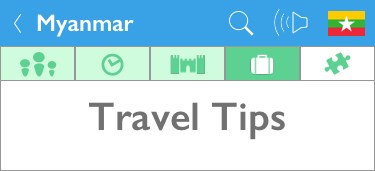
A key finding was that the Travel Tips section would need a uniquely flexible structure to accomodate travel-oriented users. This led to the design of expanding accordion portions to allow users to find specific types of data, rather than encumbering them with the swipe-through path used in the rest of the app.
Interface Design
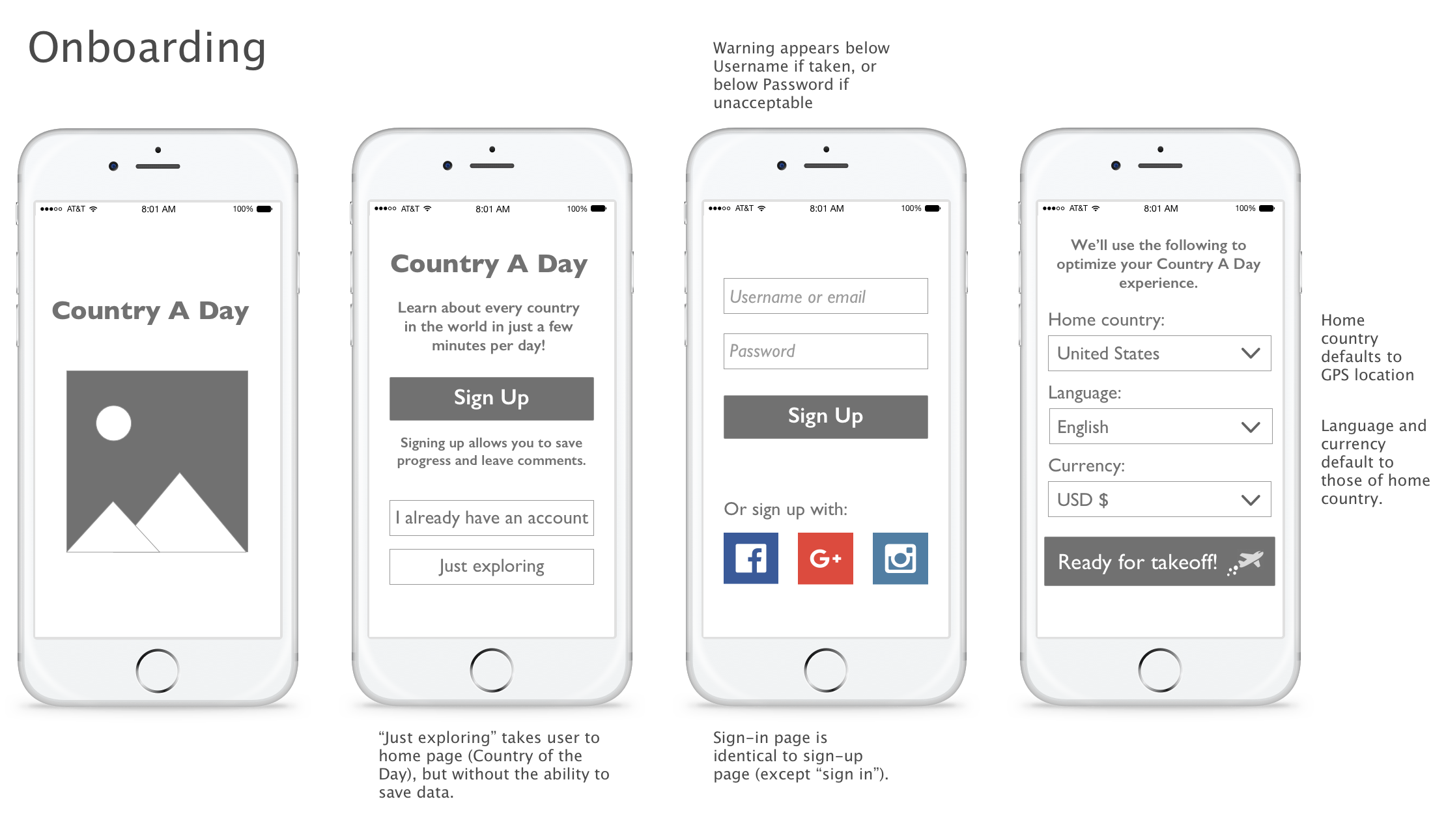
Wireframes
Throughout the wireframing process, which included both sketches and digtal wireframes made in Sketch App, several navigation choices were refined.
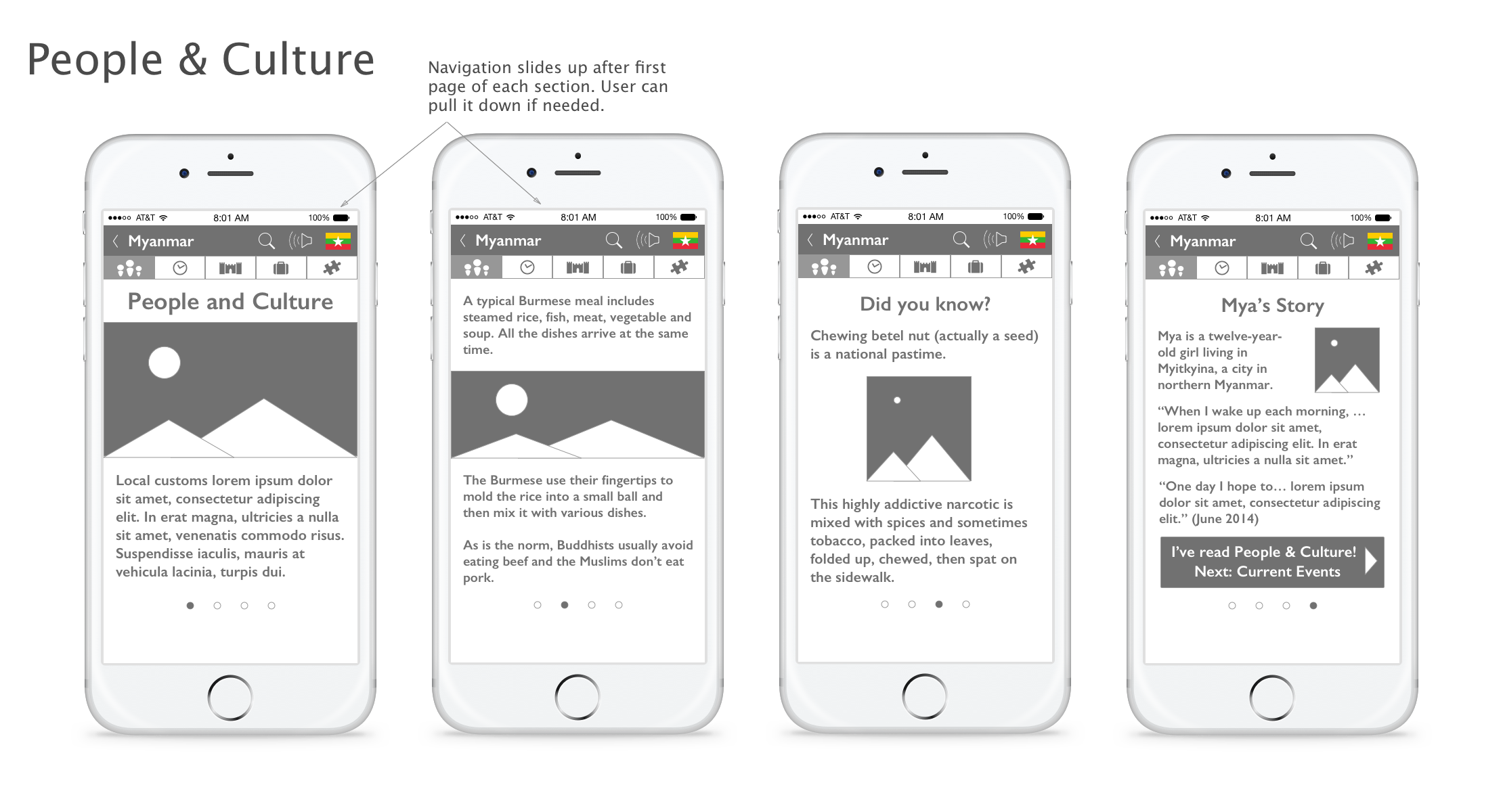
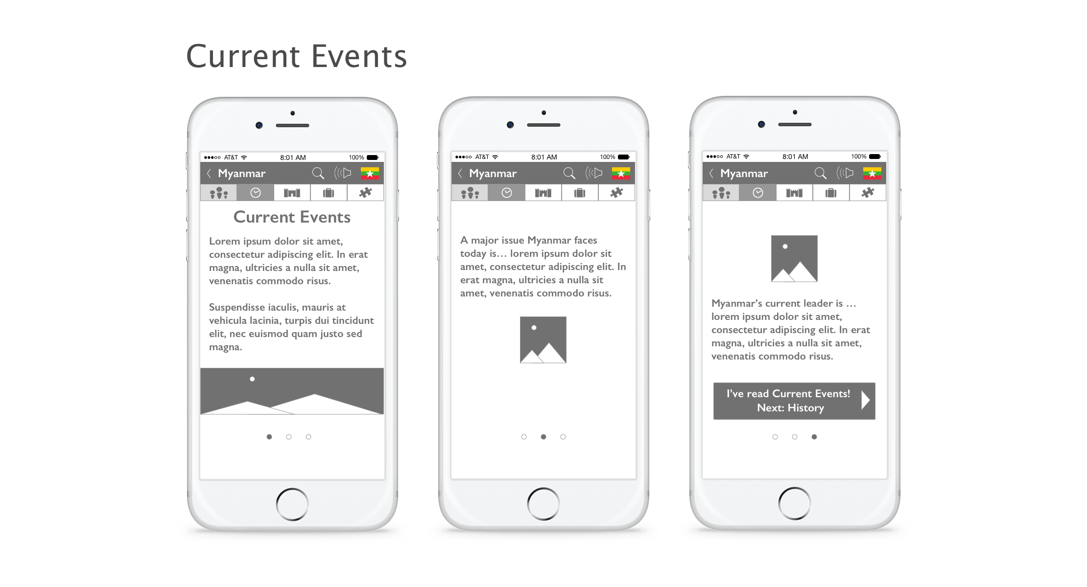
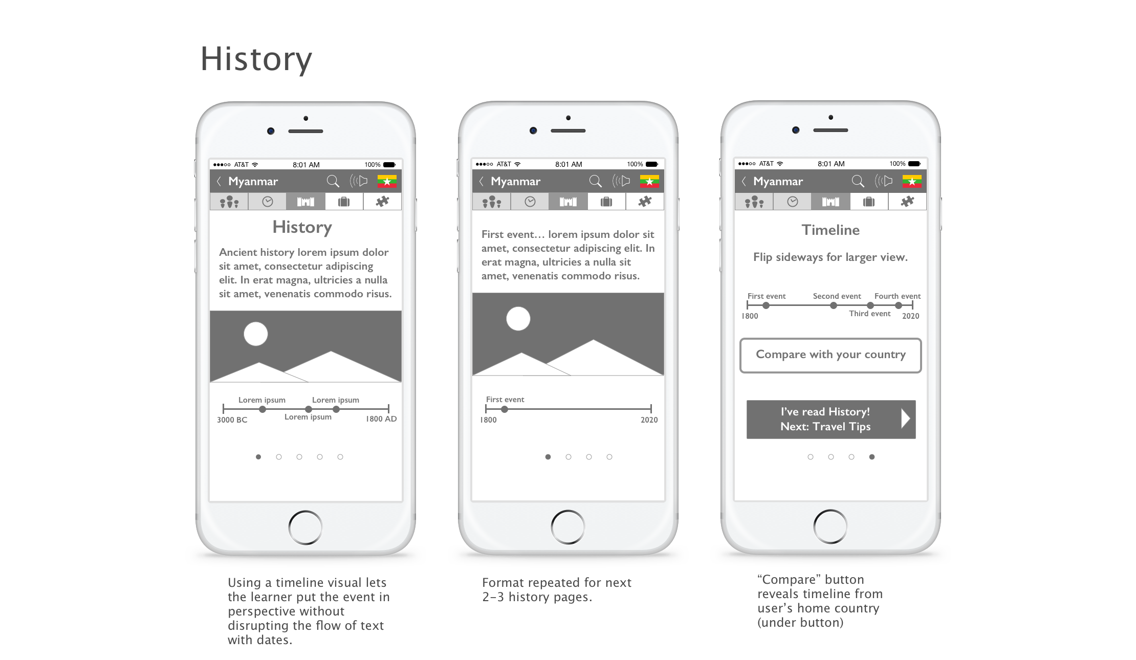
The five-icon navigation bar doubles as a progress indicator by changing color as each section is completed. This immediate visual feedback encourages users to continue, a premise confirmed during user testing. It also allows experienced users to easily locate desired content.
Click on any image below to scroll through the wireframes.
Style Guide
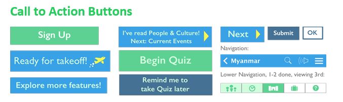
Bright global blues and greens give the app a fun and approachable game-like appeal. Canary yellow as an accent complements this palette as a cheerful highlighter to draw attention to selected answers and success pages.
Gil Sans is a clean, friendly and warm font perfectly suited to learning apps.
Design Solutions
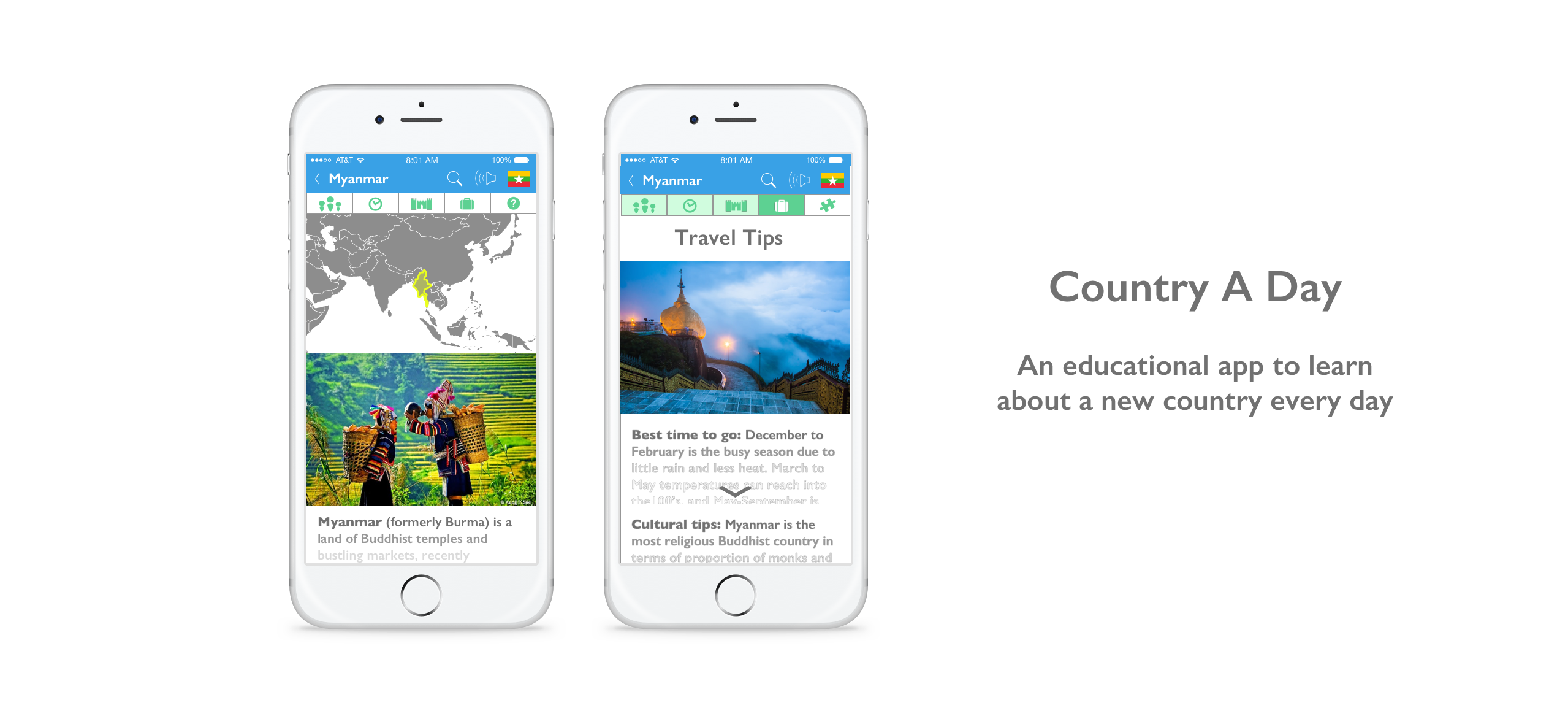
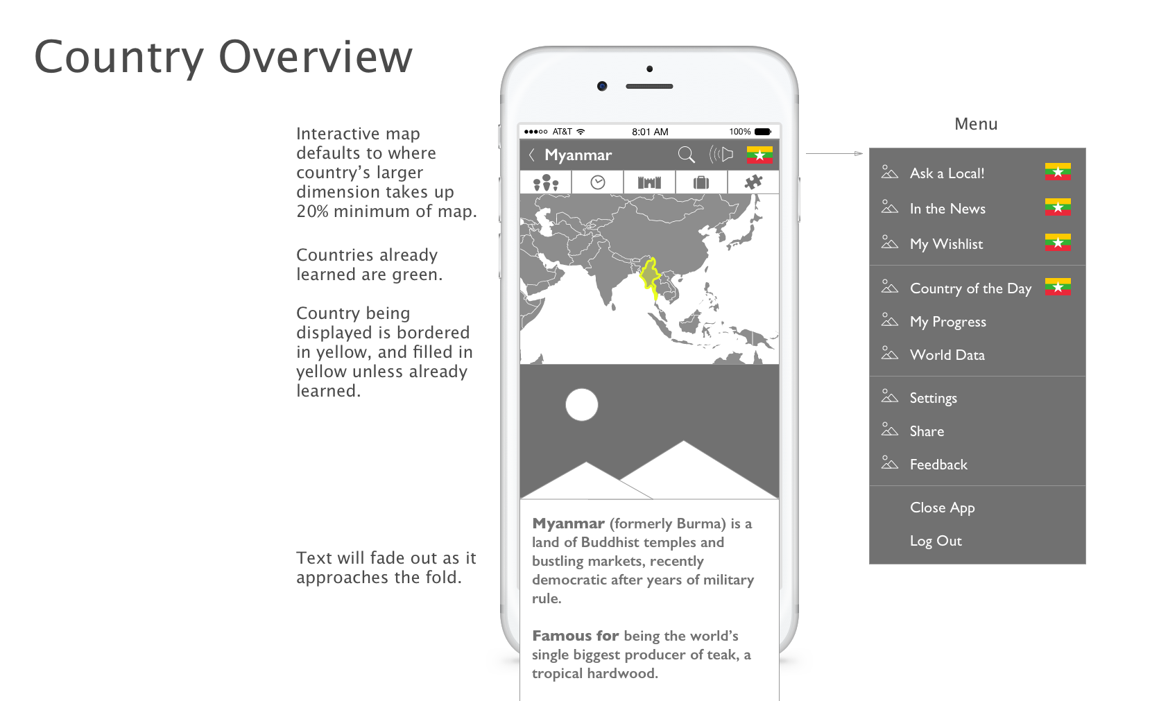
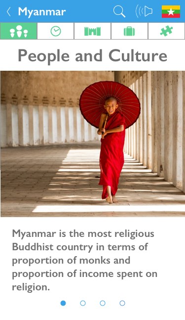
To make the app more approachable than the original text-heavy website, I decided each screen should have a striking image showing something unique about the region or inhabitants.
This content-first approach gives users a more memorable touchstone for a country even if the only thing they do each day is open the app and see the location and image.
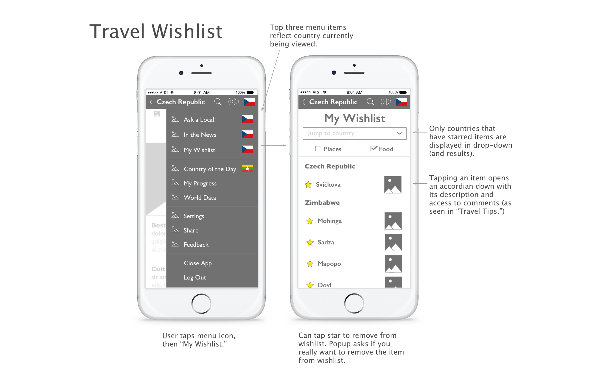
The icon navigation structure is meant to encourage exploration while giving users a clear path through each day’s lesson.
To mark progress and make the app easy to return to if interrupted, the app’s navigation changes color when a section is completed.
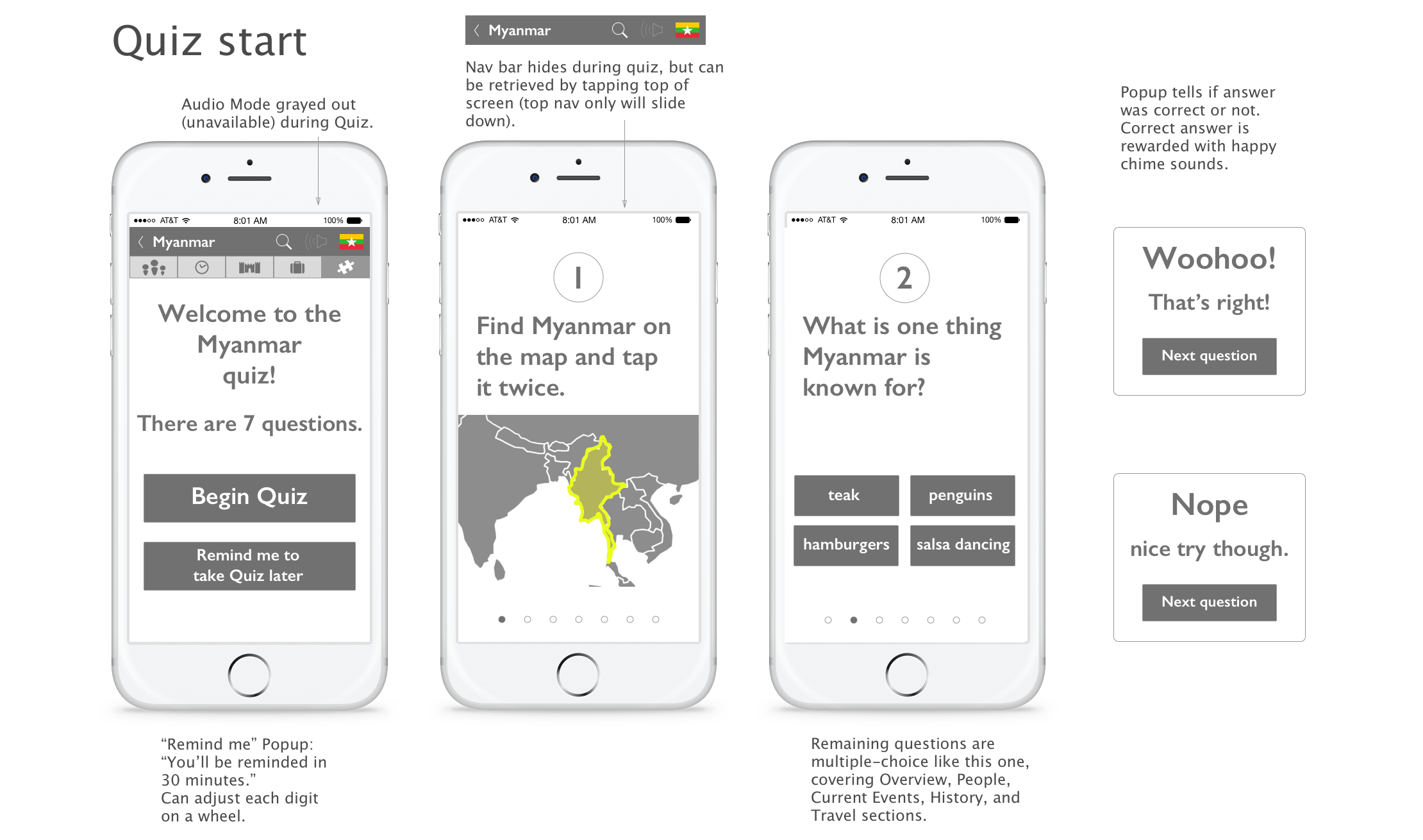
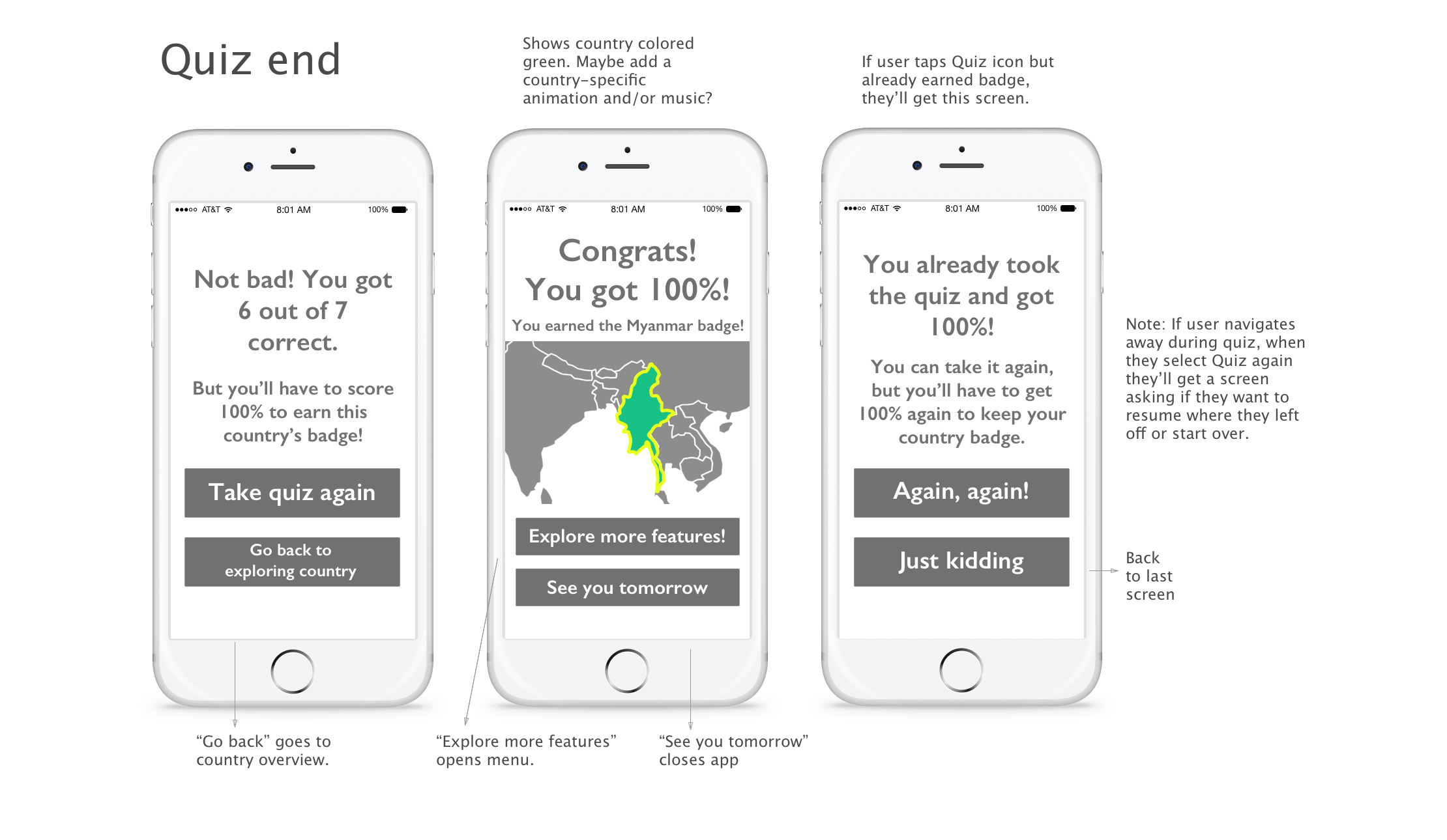
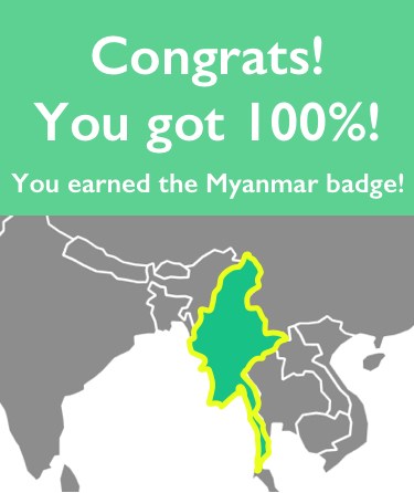
Each country’s quiz is a way to ensure that a minimal amount of information has been processed, resulting in a rewarding country “badge” that turns the country green on the world map and visually marks overall progress.
Prototype Testing
Prototype
Using InVision to display my digital wireframes on users' cell phones, I created several iterations of clickable prototypes and rigorously tested each with users.
Using wireframes rather than color mockups in the prototype ensures testers focus on function, not color and style. The prototype can be accessed on InVision here.
User Testing
Testing the prototype revealed:
- Participants still grew impatient with content-heavy pages. I slashed content even more to create bite-sized points, roughly one per screen. This traded scrolling for the more interactive swipe-through process.
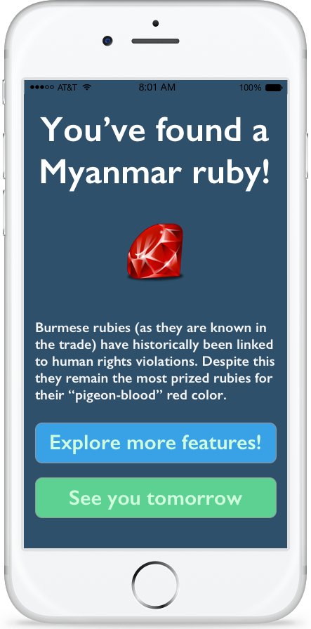
- One participant wanted the country flag to be more prominent on the Overview page, so I replaced the standard Menu button with the flag. While this unconventional button was not immediately intuitive, users did click on the flag icon and discover the menu both when needed and during exploration. In addition, when completing the quiz users are presented with an option to “Explore more features!” which opens the flag menu.
- Some participants couldn't recognize the area of the world on a zoomed-in image of a map, so I adjusted the default zoom to start further out to be more recognizable.
- The question mark icon I used to indicate “Quiz” was mistaken for a FAQ or Help section, so I replaced the icon with a puzzle piece.
- The “News and More” option was largely ignored, leading me to revert to the original name, “In the News,” which tested well in initial research and sounds more current and relevant.
- One participant spoke fondly of a gaming experience as a child, which later prompted an idea to reward users with a visual treasure for each country representing some product or other representation of the country for the user to collect. For instance, upon completing the Myanmar section a user would receive a ruby added to a "Treasure Chest" found in My Progress.
While it was humbling to discover the shortcomings of the first iteration, user testing was an extremely useful process. The insights gained drastically improved the usability and overall experience of the app.
Researching, designing and testing the Country A Day app demonstrated important concepts that can be applied to all software design. Minimizing information to make it digestible, considering the context in which an app is used, and providing the user with sufficient customization options are all best practices that can be incorporated into future projects.